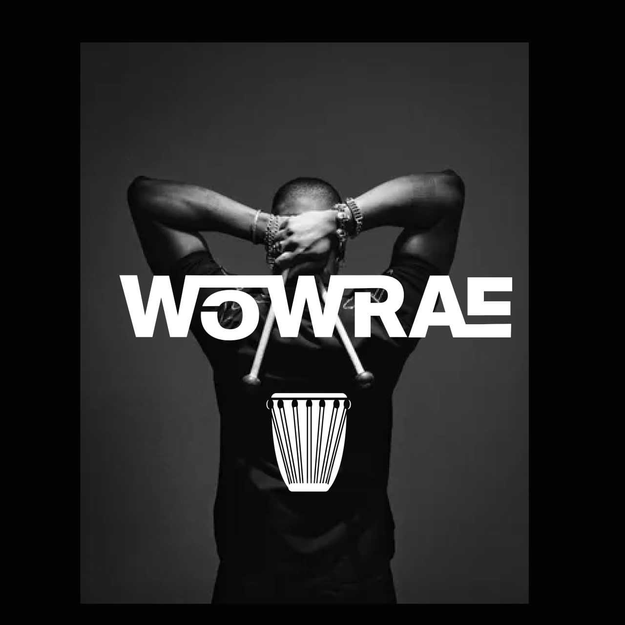
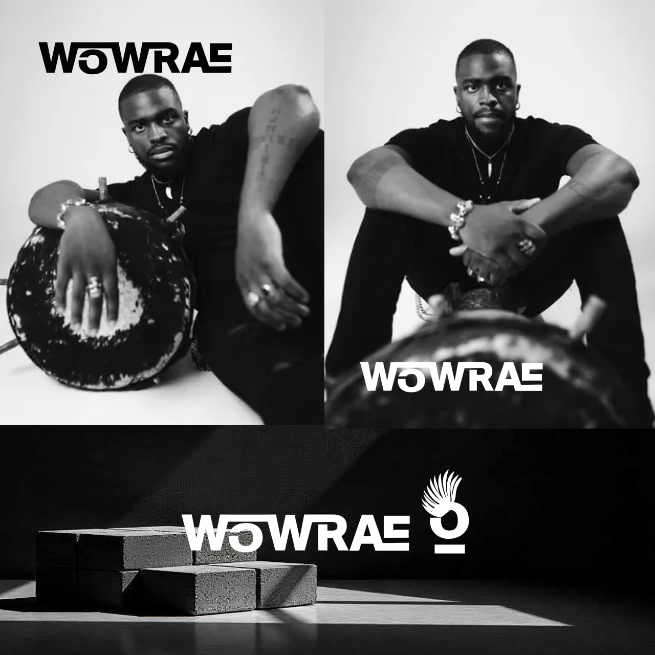
WOWRAE is a Zimbabwean-born Afrohouse artist known for electrifying live performances that blend traditional African percussion with contemporary house beats. As both a performer and teacher of the marimba and Ngoma (Zimbabwean drum), WOWRAE is on a mission to bring African instrumentation to the forefront of modern electronic music.
With a signature look always in black, adorned with silver jewelry, chunky boots, and African-modern accessories. WOWRAE needed a visual identity that embodied his dynamic style, cultural roots, and bold personality.
Design Approach
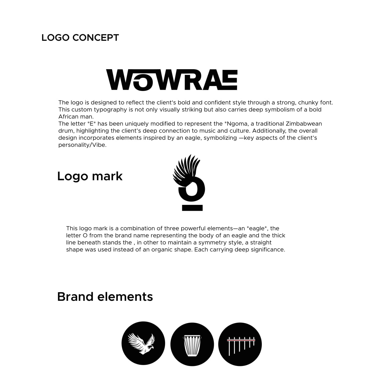
Logo Typography
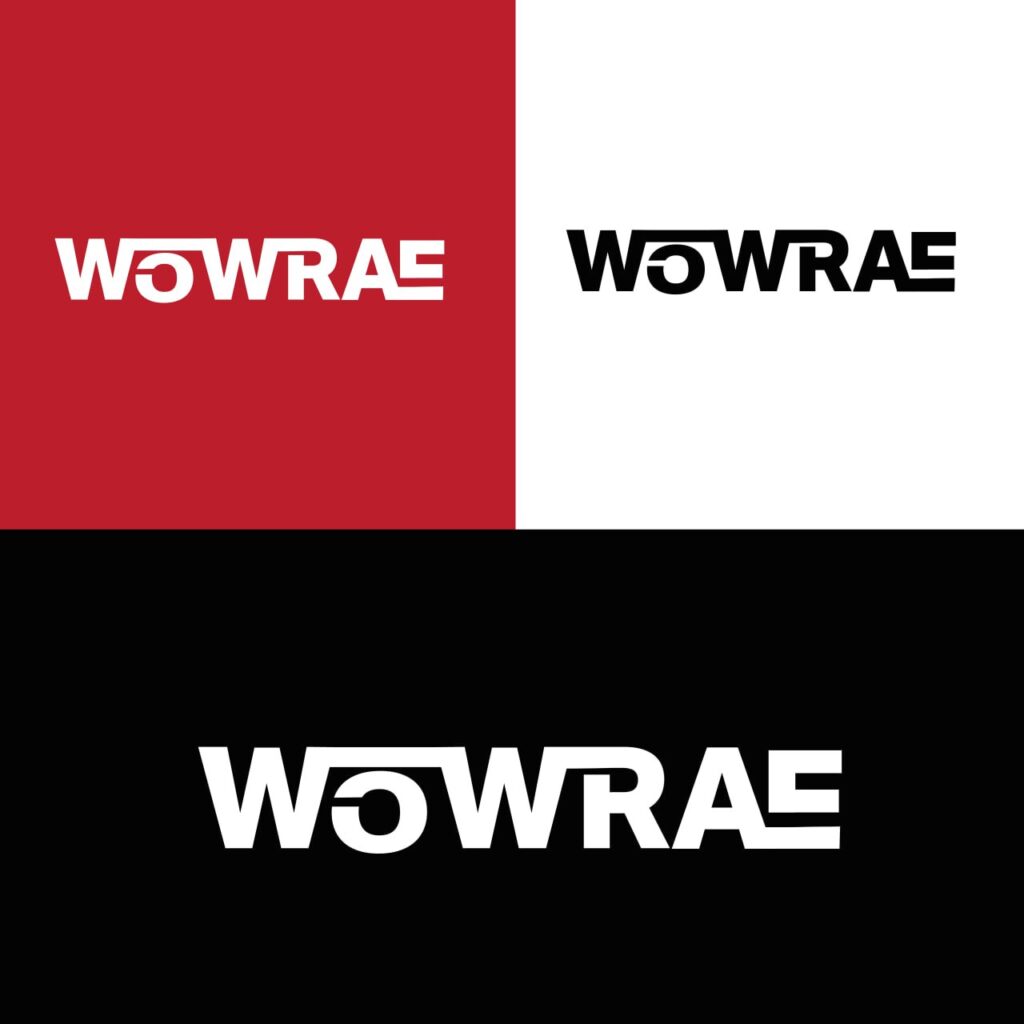
The logotype uses a chunky, custom-designed font that evokes power and presence. It was crafted to reflect the identity of a bold African man, grounded in rhythm and purpose.
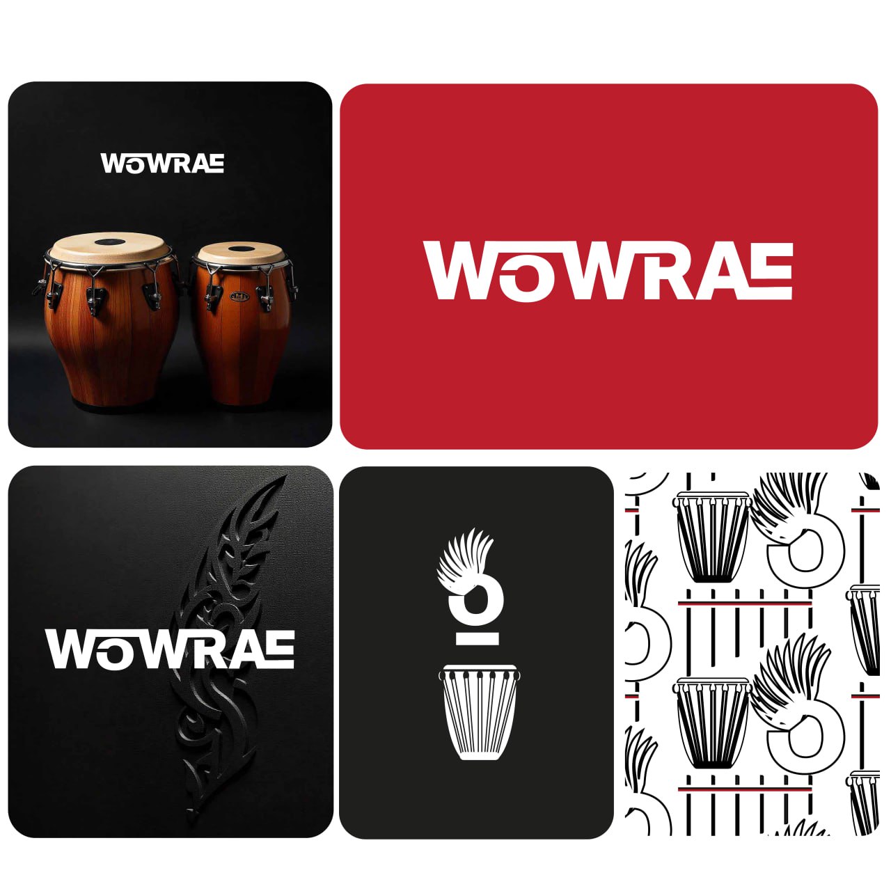
The letter E is uniquely transformed into a representation of the Ngoma drum, rooting the logo in Zimbabwean heritage.
This subtle modification bridges the auditory and visual where what you see mirrors what you hear in WOWRAE’s music.
Logo Mark
At the heart of the identity lies a layered symbol combining:
The eagle representing WOWRAE’s commanding stage presence and soaring artistic ambition.
The letter O – doubling as the eagle’s body, cleverly tying the symbol back to the brand name.
A thick underline – referencing the marimba’s horizontal structure while maintaining the client’s love for symmetry. A straight, geometric shape was chosen over organic forms to align with his sharp, modern aesthetic.
Together, these elements form a unified, striking brand mark that feels personal and iconic.